WEB
(Click on any of the logos below to see more examples of work and read their story.)
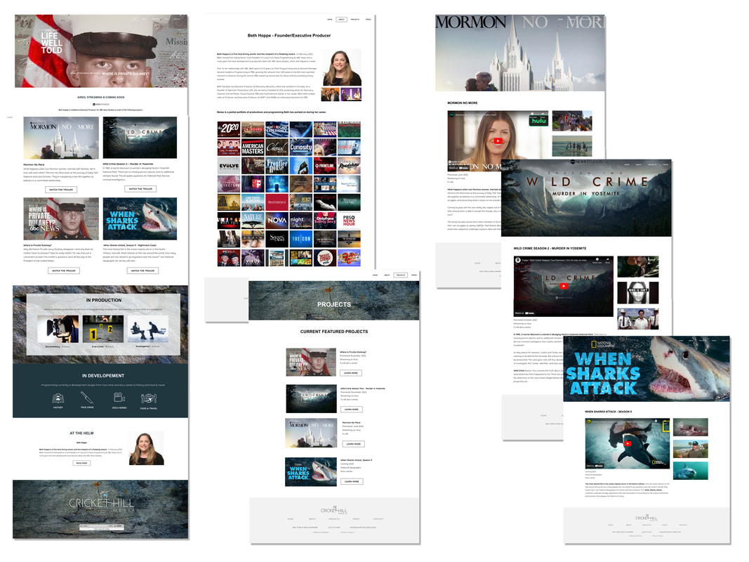
LIFE, WELL TOLD
|
LIFE, WELL TOLD
Crafting a site for this new media company is a balancing act. Living in the documentary/ news category, we had to avoid anything that smacked of embellishment. Yet, it had to appeal to those in the business and flag this as a shop with chops. There was also the issue of giving all collaborating news outlets and production companies their due without letting Cricket Hill get lost in the crowd. The result is a site that's clean, to the point and speaks volumes by saying less. |
|
|
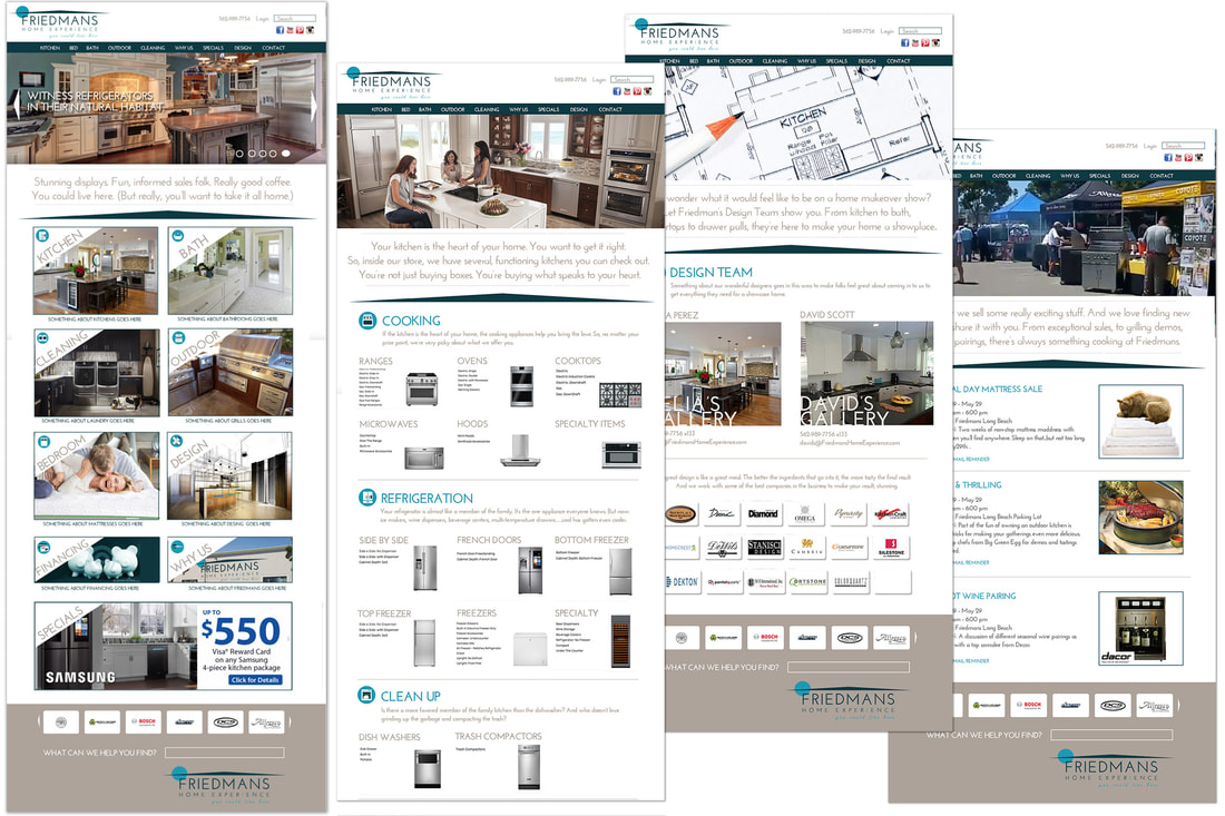
You could live here.
The logo wasn't the only challenge. How do you showcase a vast product line while maintaining a focus on experience? The website became a welcoming guided tour through the store. Clean design and a sophisticated palette makes room for the customer. And at each opportunity, the user gets encouragement to visit the physical store. Lines like, "Witness refrigerators in their natural habitat" offer a nudge and a wink, inviting them in without being pushy. |
|
|
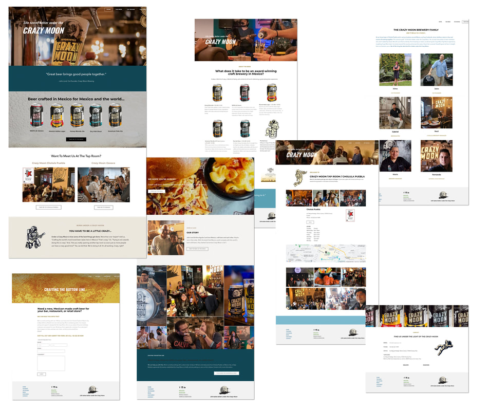
Life tastes better under the Crazy Moon A craft brewery in Mexico that was starting to get traction, had a website that was built before the brand was fleshed out. It looked like it. All they had was a commitment to stream punk. In order to design their new site, we first needed to hone in on a clear brand message. It didn't take long to see what a fun time people were having in the tap rooms. It was all about enjoying life. Once all agreed “Life tastes better under the Crazy Moon” we pared down and focused the steam punk to a funky, signature astronaut, showed an honest good time being had by all and stepped back. |
|
|
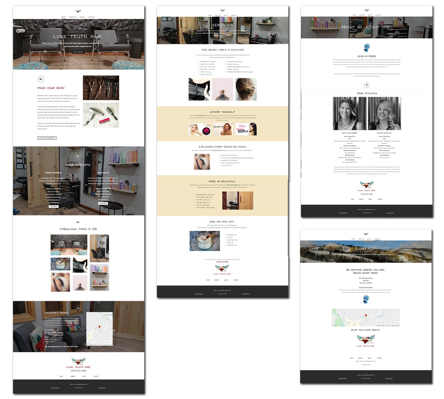
Love. Truth. Hair.
Less is more. After years of working with Ooh La La and helping quadruple annual revenue, the owner was ready to simplify her life. Being as in demand as she is, she was able downsize her shop and maintain her net income. Her new site reflects the new approach and feel of the evolved business in a way that makes clients feel like they're part of an exclusive, private boutique. |
|
|
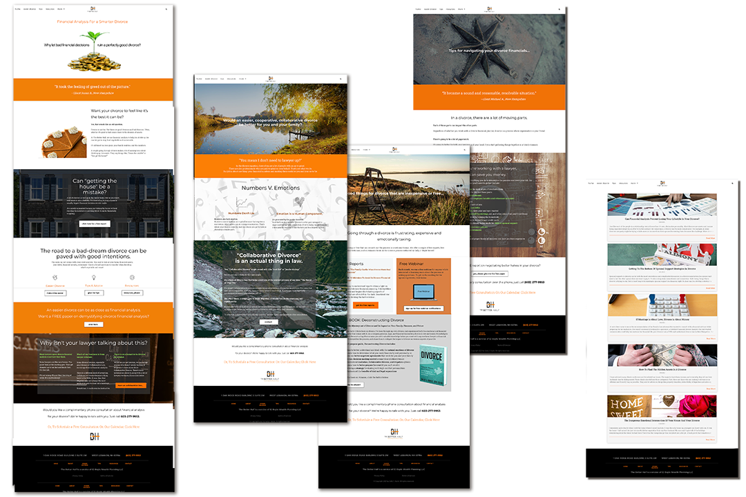
Financial Analysis For a Smarter Divorce The first line sets the tone for everything: "Why let bad financial decisions ruin a perfectly good divorce?" The goal is to make the prospect feel as if they're deal with a real person who "gets" them. No coddling. No treating them like they're going to break. And right on the first page we start by challenging some of the prime misconceptions people have regarding the smartest way to proceed with a divorce. It's a mix of insider advice, financial facts, and human understanding--all designed to that first call seem like a no-brainer.
|

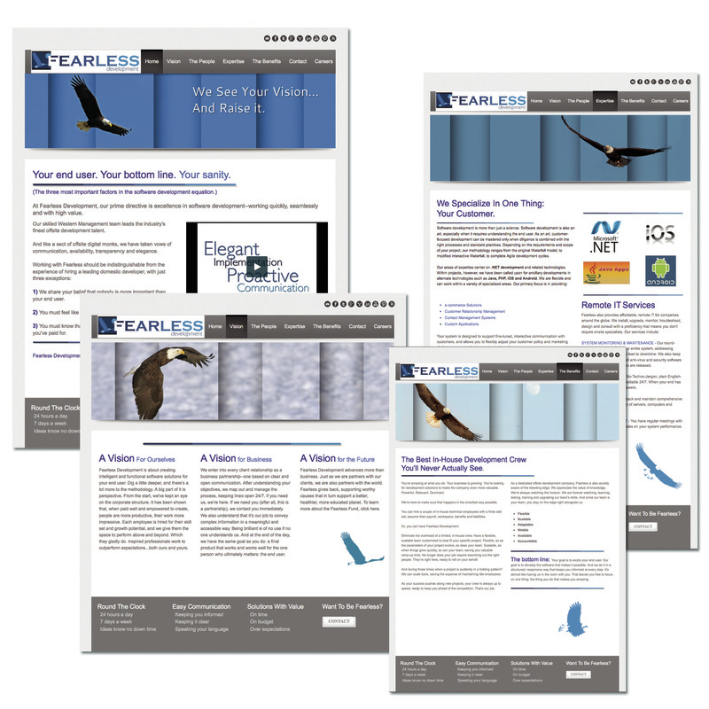
We see your vision and raise it.
Clarity, simplicity, functionality and elegance. From copy that re-positions the idea of "offshore" to merely "offsite," to a strong, clean presence inspiring collaboration and elevating the status of their partners, the website works to make being Fearless look easy.
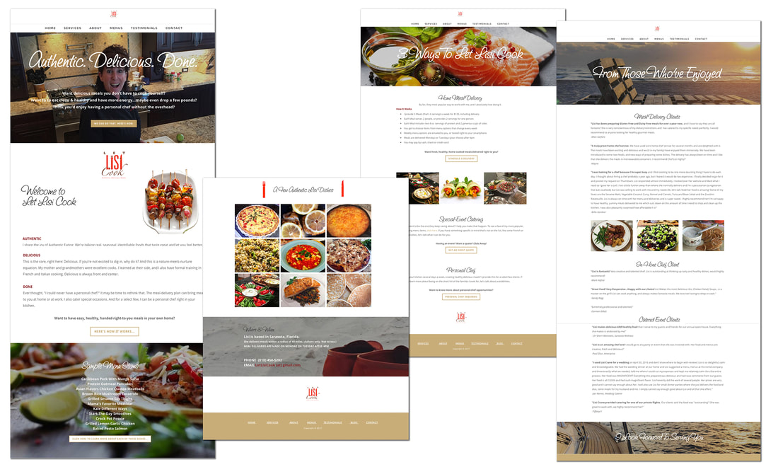
Authentic. Delicious. Done.
Make them hunger for what you've got, then make it easy to get. Lisi was offering many services, and many ways for the customer to customize those options. We encouraged her to streamline those options, then make it easy to opt in. And, of course, it all had to look and sound delicious.

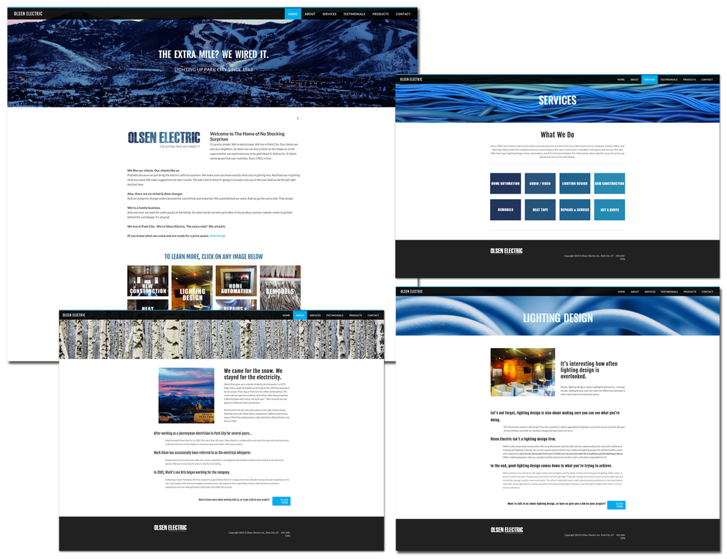
The extra mile? We wired it.
They'd never had a website, so we had a blank slate for creating one informed by the brand. Conversational copy is informed by extensive interviews, both with the Olsens and their clients. Keeping it feeling easy and upscale was key. The site plays to a customer base that's more high-end. It subtly lets the prospect know these are pros who respect their home and treat it well.
They'd never had a website, so we had a blank slate for creating one informed by the brand. Conversational copy is informed by extensive interviews, both with the Olsens and their clients. Keeping it feeling easy and upscale was key. The site plays to a customer base that's more high-end. It subtly lets the prospect know these are pros who respect their home and treat it well.
|
|
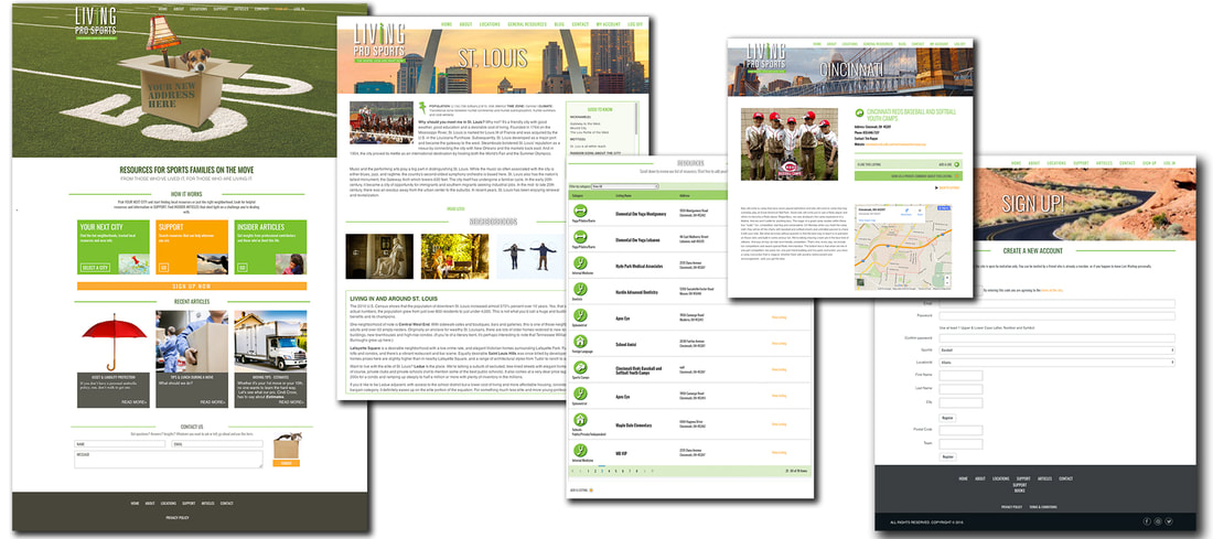
The where, how and what now. Before going live in January at the peak of NFL firing & hiring season, the mission was simple: brand the business and create a placeholder website. No "Under Construction" nonsense for the Core Customer, Ms. Pro Sports. The site also had to be clean and engaging, with enough information to entice this woman into asking for an invitation to become a paying member once the full membership site goes live. |

|
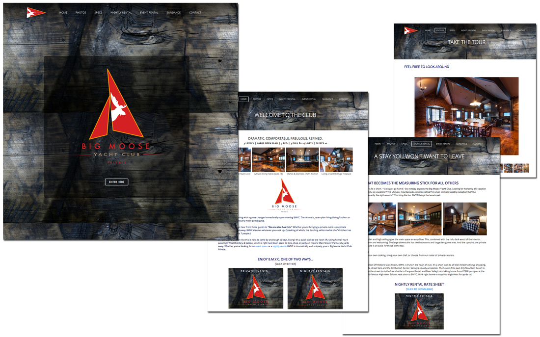
Private. Borrowing the shiplap motif of the space's interior, the website is clean yet textured. And in tune with the attitude of the brand, the landing page invites you to pass through the privacy portal to visit the the rest of the website. |
|
|
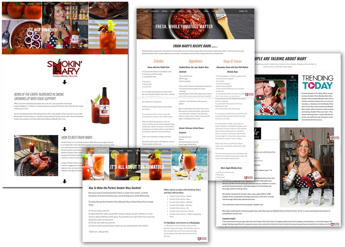
Hey, nice tomatoes
Mary has a style all her own. The owner of Smokin' Mary is not too shy to show up at food events in her signature polka-dot dress. So she also flaunts it on the website. Fresh, whole tomatoes are big and bold and so is she. |
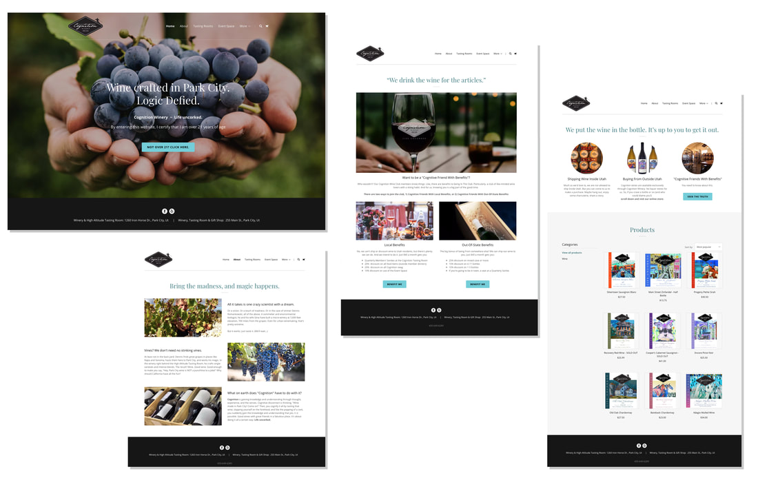
Life uncorked
So the client said, "Have fun with it." Famous last words, right? Well, they meant it. They went for headlines like, "We put the wine in the bottle. It's up to you to get it out." And calling their wine club, "Cognitive Friends With Benefits." They were for it all. And so did their customers. The positive vibes started flowing immediately. Cheers!

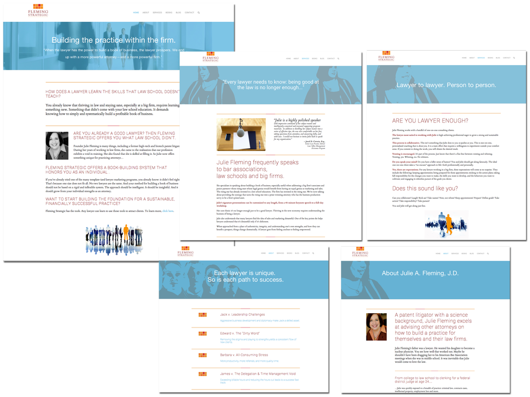
Building the practice within the firm.
The website is a balancing act. It has to work for big firm attorneys as well as solo practitioners. It must convey information with a direct-response element, yet not feel too salesy. It has to feel as if we have an astute lawyer working for other lawyers, while standing apart from the competition. According to Julie Fleming (and more importantly, her clients), the site hits all the right notes. The response was remarkable and immediate--an increase of more than a 50% over the old brand and website.

Music's never ending encore
This singer/songwriter fan membership site was a groundbreaking idea based on the "1,000 true fans" principle. There was always fresh content on the home page to entice the frequent user to check out new material. The overview also had to be broad enough that the new visitor would be intrigued enough to take the tour. With so much content, clear and usefully redundant navigation was key.
This singer/songwriter fan membership site was a groundbreaking idea based on the "1,000 true fans" principle. There was always fresh content on the home page to entice the frequent user to check out new material. The overview also had to be broad enough that the new visitor would be intrigued enough to take the tour. With so much content, clear and usefully redundant navigation was key.