|
|
Friedmans Home ExperienceWhen a business' brand finally reflects the integrity of its owner...
In some categories, it's easy to fall into the trap of sounding like everyone else. Expectations lead to comfortable, familiar, me-too branding. Friedmans Appliance Center had fallen into that trap. In business for almost 40 years, this family-owned appliance, bath & bed superstore in Southern California was wrapped in a brand that in no way reflected what was happening inside the wrapper: a magnetic family atmosphere, an elevated experience, and a loyal, longtime repeat customer base. Everything that made the customer experience special was absent from the marketing communications. After witnessing firsthand what made Friedmans unique and better, we began nudging the owners out of their comfort zone, and into trusting change for the better. The new brand dares to speak like a person and celebrate the joy of working with Friedmans for improving kitchen and bath. After initial trepidation, the Friedmans Home Experience brand was fully embraced by the owners and staff. And, within the first few months of roll-out (new name, tagline, signage, trucks, print, TV, radio and video), Friedmans experienced their biggest month since the 2008 financial crisis, with a 33% increase in sales. Friedman Home Experience. You could live here.
|


LOGO
Before & after, meet night & day. The linchpin to re-branding success was getting the owners to leave behind their old logo. They'd had it for over 30 years. It felt just like the microwave-oven specialty retailer that used to be. The familiarity of it was comfortable for them, but was in no way reflective of the elevated experience inside. Change is always uncomfortable. Nonetheless, we were able to take them out of the 1980s into the 21st century with clean lines and a warmer, more welcoming pallet. All that's good, right and true in home appliances is under their roof, and it can be under yours.
BEFORE |
AFTER |
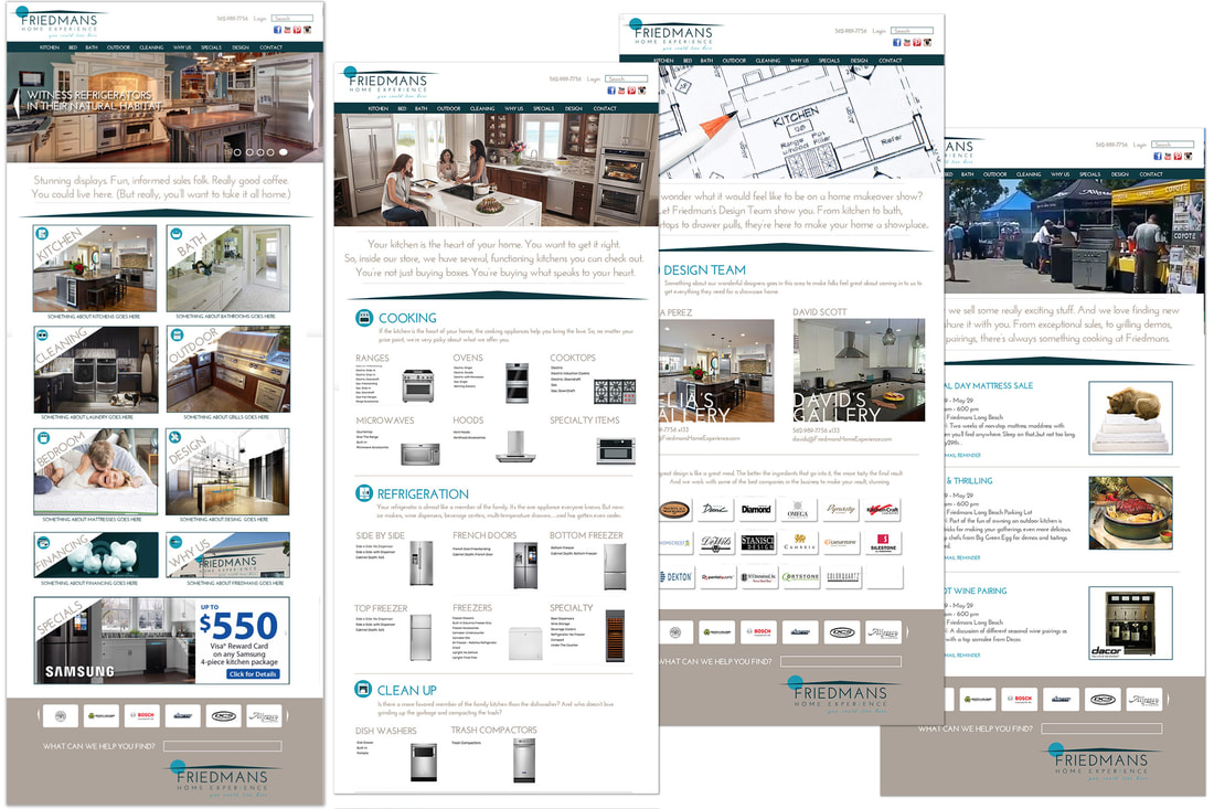
WEB
The logo wasn't the only challenge. How to showcase a vast product line while maintaining a focus on experience? The website became a welcoming, guided tour through the store. Clean design and a sophisticated pallet made room for the customer. And at each opportunity, the user gets encouragement to visit the physical store. Lines like, "Witness refrigerators in their natural habitat" offer a nudge and a wink, inviting them in without being pushy.
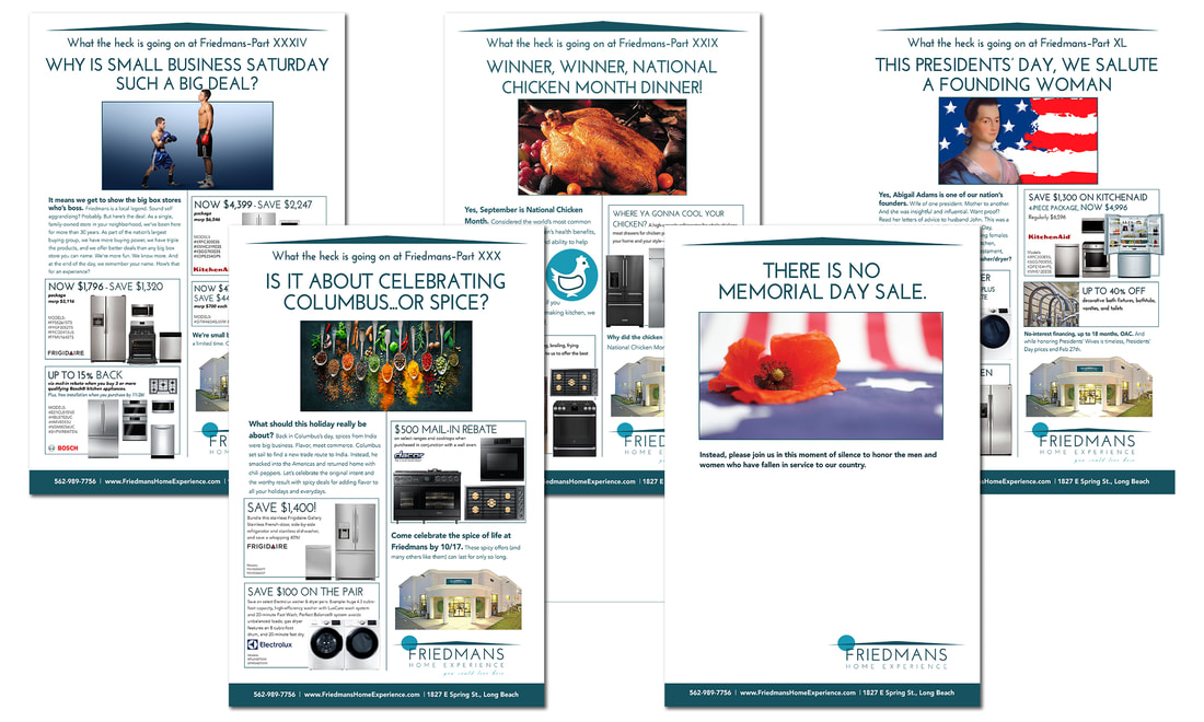
PRINT
In a community that loves its local newspaper, developing an ongoing print campaign was key. The prospect needed to see that something different was happening inside Friedmans. The print defied the convention picture/price paradigm of the local competitors, and became as welcoming an experience as the store. It was done with long copy, engaging headlines, storytelling, a consistent graphic look, and actual reasons to visit the store. And ads like the simple photo and white space for Memorial Day reminded the reader that Friedmans is more than just a shopping experience. They're also a member of the community.
VIDEO
A little something extra to go with the holiday specials. We knew there'd be a lot of videos for holidays and vendor-specific offers, To balance the "big sale" messages was a series of interview videos with the owner, the manager, the salespeople, even the truck drivers. We let them each talk about why they loved working there. The result is candid, unvarnished reflections of the customer experience at Friedmans. We like them all.
|
|
|
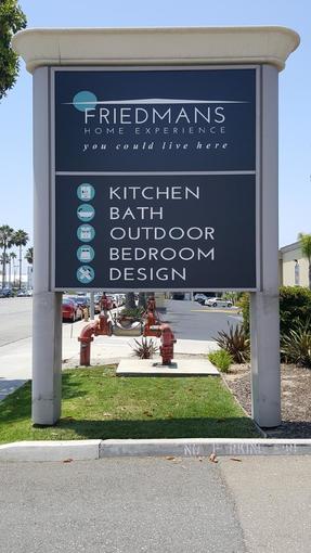
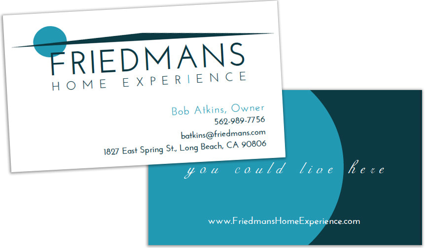
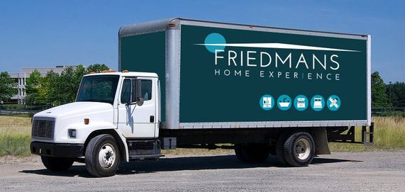
COLLATERAL
From signage to delivery trucks, it all had to change. Since this is a better experience, from shopping to purchase, delivery to follow-up, the devil is deeply rooted in the details. For instance, for the first time ever, the truck drivers got their own business cards. The resulting morale boost was impressive. One driver received his business cards, and approached the owner. He asked the man if, when he did a great job at delivery and installation, and he helped drive referral business, could he get a commission? Color the owner thrilled.
|
|