|
Annmarie Skin CareAnnmarie & Kevin Gianni have an all-natural skin care line that's taking off.
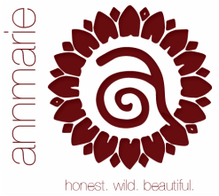
They're selling a lot of product direct, but the brand was too undeveloped and unfocused for a mass market. (The logo was busy and vaguely resembled a doily.) Refining the logo to a more contemporary version of its original self was followed by a developing a new tagline appealing to the prospect's part in Annmarie's beauty rebellion. The brand name Annmarie Gianni Skin Care was distilled to its most potent element: the healthy, vibrant hottie who started it all The product line grows directly from her lifestyle and passions, She's the kind of woman other women aspire to be. How's it all working? Visit their e-commerce site, or visit them in person at the Berkeley, CA retail store and see for yourself. Annmarie Skin Care. Honest. Wild. Beautiful.
|


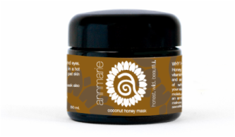
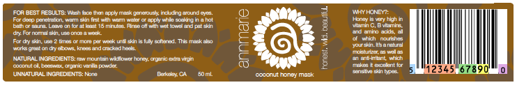
PACKAGING
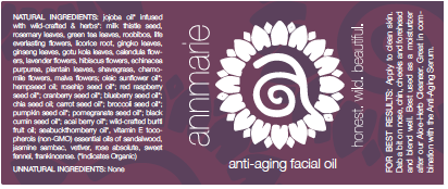
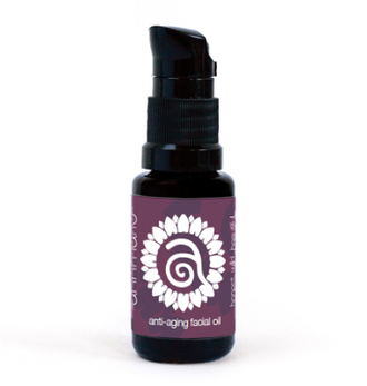
Labeling with colors found in nature? Who'd have thunk it? Ghosting the logo large in the background helped give the label the impression of an organic texture The biggest challenge? Voluminous, legally-mandated compliance language on labels for really tiny containers. Challenging, but solvable.
|
|
|
|
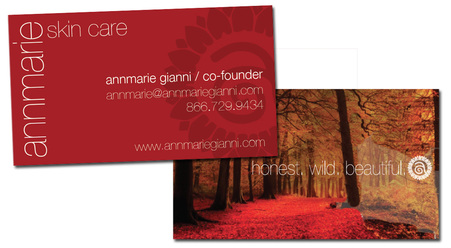
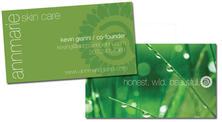
COLLATERAL
The business cards and other support materials feature images from nature. Each card is color coded to the person who uses it. They all work together, but no two are the same.
|
|